微信小程序自己開發(fā)了一套 wxml + wxss,對許多 HTML 標簽和 CSS 屬性不支持。
不支持 table 標簽,推薦使用 flex 布局。
自然而然的想法:flex 嵌套,效果還不錯,貼代碼如下:
<view id="panel" class="flex-column">
<view class="flex-cell flex-row">
<text class="flex-cell flex-row">1</text>
<text class="flex-cell flex-row">2</text>
<text class="flex-cell flex-row">3</text>
<text class="flex-cell flex-row">4</text>
</view>
<view class="flex-row flex-cell">
<text class="flex-cell flex-row">1</text>
<text class="flex-cell flex-row">2</text>
<text class="flex-cell flex-row">3</text>
<text class="flex-cell flex-row">4</text>
</view>
<view class="flex-row flex-cell">
<text class="flex-cell flex-row">1</text>
<text class="flex-cell flex-row">2</text>
<text class="flex-cell flex-row">3</text>
<text class="flex-cell flex-row">4</text>
</view>
<view class="flex-row flex-cell">
<text class="flex-cell flex-row">1</text>
<text class="flex-cell flex-row">2</text>
<text class="flex-cell flex-row">3</text>
<text class="flex-cell flex-row">4</text>
</view>
<view class="flex-row flex-cell">
<text class="flex-cell flex-row">1</text>
<text class="flex-cell flex-row">2</text>
<text class="flex-cell flex-row">3</text>
<text class="flex-cell flex-row">4</text>
</view>
</view>
#panel{
height:65vh;
background:#fff;
}
#panel text{
line-height: 13vh;
border-right: 1rpx solid #ddd;
border-bottom: 1rpx solid #ddd;
}
.flex-row{
display: flex;
flex-direction: row;
justify-content: center;
align-items: center;
}
.flex-column{
display: flex;
flex-direction: column;
justify-content: center;
align-items: stretch;
}
.flex-cell{
flex: 1;
}
微信小程序
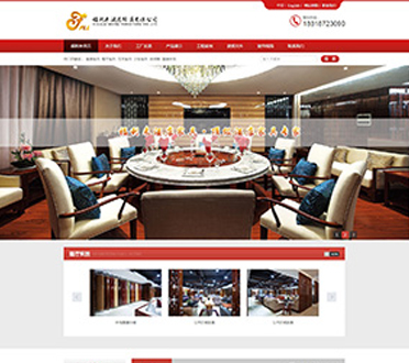
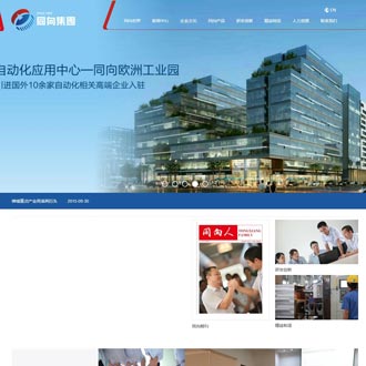
企業(yè)網站建設一條龍
找零度飛易網絡公司-fslingdu所做php
網站建設方案、
網站設計、
網站制作由
北京上海深圳龍崗衢州蘭州常州東營南通濟寧桂林淮安煙臺長春無錫天津昆山蘇州合肥貴洛陽昆明天津唐山泉州惠州萬州新鄉(xiāng)商丘臺州哈爾濱太原攝影海口隨州學校商丘廣東湖南廣西江西海南廣州企業(yè)中小企業(yè)武漢南山羅湖福田虎門肇慶汕尾汕頭廣州佛山成都杭州濟南重慶福州西安廈門昆山沈陽青島徐州鄭州南京寧南寧長沙大連淄博石家莊南昌溫州珠海番禺順德南三水高明中山東莞合肥江門嘉興西寧大良容桂倫教勒流陳村均安杏壇龍江樂從北滘祖廟石灣南莊等地區(qū)
企業(yè)網站建設(廣告)公司提供專業(yè)做網站價格規(guī)劃書及
營銷型網站制作,
網站建設基礎知識


 零度飛易是一家專業(yè)網站設計,網站制作、seo優(yōu)化,網站推廣,網站建設的佛山網絡運營公司。零度飛易在